New Taipei's 1.2 Million Address Signs Being Replaced|新北隔23年換發新門牌 配色引發論辯
加入公視會員,
按讚收藏你關注的報導
發布時間:
更新時間:
New Taipei City has not changed address signs in 23 years. On Mar. 27, the New Taipei City Government released the new address sign design. There were immediate complaints about the colors of the signs and some people said they were less recognizable than before.
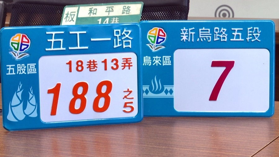
New Taipei City recently released the design for new address signs, which were last replaced 23 years ago. The design features the unique characteristics to each of the city's 29 districts. Wulai's sign, for example, features indigenous motifs and hot springs while Tucheng's features Tung oil blossoms.
Tucheng has a Tung oil blossom festival, so Tung oil blossoms were included. (Do you think this is an improvement?) Of course it is.
Signs for odd-numbered and even-numbered street addresses will be, respectively, purple and orange.
All the colors are kind of tacky. The colors aren't very nice.
The designer of the signs responded to the criticism.
Blue and green are the colors of nature. They are happy colors and colors of inclusivity.
We have taken everyone's opinions into account and we will continue discussions with the company and our consultants.
The New Taipei City Government says the contract for the new signs was signed by the previous administration and the signs are already in production. An estimated 1.2 million signs will be replaced before the end of February next year.
已經23年沒換發的新北市門牌,新門牌設計上,融入新北市29區的特色做為插圖,像是烏來區,就結合原住民圖騰、溫泉;土城區,就標上油桐花。
民眾 周先生表示:「土城因為有桐花季,把桐花的那個意象放進去,(所以你覺得這樣比較好?)當然是比較好。
另外新門牌上的字 ,還以顏色區隔單雙號,單號是紫色,雙號是橘色。
民眾 黃小姐表示:「綠綠紅紅的,沒有很優雅,顏色不是很好看。」
配色引發民眾質疑,門牌設計師出面解釋設計理念。
新北市門牌設計師 陳文順表示:「藍跟綠是大自然的顏色,這個是一個幸福的一個色彩,一個包容的色彩。」
新北市政府民政局秘書 賴冠群表示:「所有民眾的意見我們都聽到了,那我們也會持續跟廠商還有老師,持續溝通。」
新北市政府表示這次門牌發包是上任市長做的,已經進入製作階段,預計換發120萬面,明年2月以前換發完畢。